
Three-dimensional (3D) data visualization is rapidly gaining momentum as organizations seek more immersive ways to analyze and present complex information. Unlike traditional 2D charts, 3D visualizations add depth and spatial context, allowing viewers to explore data from multiple angles. In this article, we’ll explore what 3D data visualization means, its key benefits, how it works, when to use it, and the top tools available
What Is 3D Data Visualization?
3D data visualization is the practice of representing data in a three-dimensional space (with X, Y, and Z axes) to provide a perception of height, width, and depth in the visualized information. In essence, it extends the familiar concepts of charts or graphs into a 3D coordinate system. This allows viewers to see multiple data dimensions at once and observe patterns or relationships that might be hidden in flat 2D representations.
The Benefits of 3D Data Visualization
When implemented correctly, data visualization 3D offers a range of benefits that go beyond what standard 2D charts provide. Below, we break down some of the key advantages:
Enhanced data comprehension
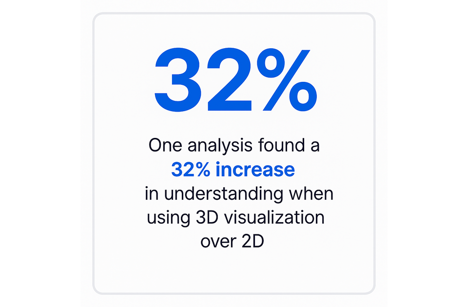
One of the greatest strengths of three-dimensional visualization is improved understanding of complex data. By introducing depth, 3D charts can encode an additional variable or reveal structures in data more intuitively. Studies have shown that moving from flat graphs to 3D visuals can boost data comprehension significantly – one analysis found a 32% increase in understanding when using 3D visualization over 2D.
Improved decision-making
Better comprehension naturally leads to better decisions. When decision-makers can literally see a more complete picture of the data, including subtleties that 2D might miss, they are equipped to make more informed choices. By exploring data in three dimensions, analysts can uncover insights that drive strategy and identify optimal solutions faster.
Real-time interaction and analysis
Many 3D visualization platforms support real-time data streaming and user interaction, which is a game-changer for analysis. In a 3D dashboard, users can often pan, tilt, or zoom the view to examine specific details, as well as adjust parameters or filters, with the visualization updating instantly. This real-time interaction means analysts aren’t passively viewing charts – they’re actively interrogating the data.
Efficient communication of insights
3D data visualization isn’t just useful for the analyst at their workstation – it’s also a powerful way to communicate insights to others. Complex ideas that might require several slides of 2D charts can sometimes be conveyed with a single well-crafted 3D visual. This efficiency in storytelling is crucial when communicating with stakeholders who may not be deep into the data themselves.
Customization and scalability
Another benefit of 3D data visualization is the high degree of customization and scalability it offers. On the customization front, users can often tailor a 3D visual to their needs – choosing which dimensions to visualize as axes, what variables to use as color or size cues, and how to present the scene. Many 3D tools let you build very specific representations (e.g. a custom 3D model of a product with data-driven attributes) that would be impossible with generic 2D chart types.
Integration with emerging technologies
Perhaps one of the most exciting benefits of 3D data visualization is how naturally it integrates with emerging technologies like augmented reality (AR), virtual reality (VR), and artificial intelligence (AI). In AR and VR environments, data has to be visualized in 3D – these technologies place digital content into the physical 3D world or immersive virtual spaces.
How Does 3D Visualization Work?
3D visualization works by translating data values into a spatial form and relying on graphics technology to display it realistically. This process has become easier with high-level libraries (like Three.js for web or VTK for scientific computing) that abstract away the gritty details of 3D math and rendering. As a user or decision-maker, you don’t have to build these from scratch – you interact with software that does it for you. Understanding this pipeline, however, underscores why three-dimensional visuals are so powerful: they create a virtual world where your data lives, one that you can explore almost as if it were a physical object.
When to Use 3D in Data Visualizations?
Not every chart needs to be three-dimensional. In fact, gratuitous use of 3D can sometimes hinder rather than help (for example, a three-dimensional pie chart adds distortion without adding insight). However, there are certain scenarios and data sets where using a three-dimensional visualization is highly beneficial. Here are some key situations when 3D is the right choice for data visualization:
For complex multidimensional data
If your data has more than two important variables to analyze simultaneously, a 3D visualization is a natural fit. Traditional 2D charts are limited to two axes (and perhaps color or size for a third variable), but a 3D plot can directly show three axes of data. This is valuable for complex, multidimensional datasets where interactions between three (or more) variables are critical.
To highlight spatial relationships
Certain data is inherently spatial – meaning location, position, or geometry are part of what you’re analyzing. In such cases, a 3D visualization is often the most direct and meaningful way to represent the information. Geographic and geospatial data are prime examples: while a 2D map can show latitude and longitude, adding a third dimension can represent altitude or intensity (think of a 3D terrain map or a 3D bar map where towers rise from city locations, indicating some metric).
For engaging non-technical audiences
When your goal is to present data insights to a broad or non-technical audience, engagement and storytelling become as important as the data itself. Here, 3D visuals can have a strong impact. People who may tune out a flat spreadsheet or a bland 2D chart could become intrigued by a well-designed 3D visualization because it’s more experiential. Psychologically, 3D graphics often feel more modern and cutting-edge, which can help capture attention in settings like executive presentations, marketing material, or public reports.
In real-time dashboards
When monitoring systems or processes in real time, having a 3D visualization can provide an at-a-glance clarity that 2D dashboards might not. Real-time dashboards are common in operations centers, whether it’s an IT network operations center, a smart city control room, or a manufacturing plant’s IIoT monitoring system. In these scenarios, you often have a complex environment with many data points updating continuously. A 3D model-based dashboard – sometimes called a digital twin – can map data readings directly onto a representation of the physical system.
With virtual or augmented reality
If your project involves delivering data through virtual reality or augmented reality, three-dimensional visualization isn’t just an option – it’s essentially a requirement. VR places users in an immersive three-dimensional environment, and AR overlays digital information onto the 3D real world; in both cases, data visualizations must be rendered in three dimensions to appear correctly. So, one obvious case for 3D is whenever the medium is VR/AR. But beyond that, even considering whether to build an AR/VR data experience depends on if 3D adds value. Scenarios that are fantastic for VR/AR data visualization include training simulations (e.g. a VR simulation of a data-driven scenario, like navigating through a 3D graph of an organization’s structure), collaborative data analysis (virtual “war rooms” where teams interact with the same 3D data model from different locations), or public exhibits and storytelling (augmented reality data art installations, for instance).
For predictive model visualizations
When dealing with predictive analytics and simulations, three-dimensional visualizations can be incredibly useful to interpret model outputs and complexities. Predictive models (such as those in machine learning, forecasting, or scientific simulations) often involve multiple variables and results that play out over time or across scenarios. Using 3D (and even adding animation for time = a 4th dimension) helps in visualizing these outcomes.
What Are the Best Tools for 3D Data Visualization?
There is a rich ecosystem of tools and software available to create three-dimensional data visualizations, ranging from business-friendly BI platforms to specialized scientific visualization suites. The “best” tool depends on your specific needs – whether you prioritize ease of use, real-time interactivity, handling of large datasets, integration with coding, or domain-specific capabilities. Below is an overview of some of the top three-dimensional data visualization tools (in no particular order), and what makes each stand out:
Tableau
Tableau is a leading business intelligence platform known for its drag-and-drop ease of use and interactive dashboards. Out of the box, Tableau focuses on 2D charts, but it does offer some three-dimensional capabilities (for example, three-dimensional maps using Mapbox integration, or certain 3D graph extensions). More importantly, Tableau is actively exploring immersive analytics – it has demonstrated integration with AR/VR, such as using Apple’s Vision Pro headset to put Tableau visuals into a spatial three-dimensional environment
Microsoft Power BI
Power BI is Microsoft’s powerful business analytics tool, part of the Power Platform, and it’s widely used for enterprise reporting. Like Tableau, Power BI primarily creates 2D visuals but offers some 3D options through custom visuals. For instance, Power BI supports three-dimensional maps (via Bing’s 3D map visual), and there are community visuals for things like 3D scatter plots or surface plots. Microsoft has also experimented with mixed reality integrations: using HoloLens (Microsoft’s AR headset), one can project Power BI dashboards into a real space, effectively adding a three-dimensional layer to the visualization. In fact, Microsoft’s tech demos have shown scenarios where an executive using HoloLens can see floating bar charts and trend lines in their office that update in real time from Power BI – an engaging way to monitor KPIs.
Vaa3D
Vaa3D (Visualization-Assisted Analysis in 3D) is an open-source software suite specifically designed for 3D, 4D, and even 5D image visualization and analysis, with a strong emphasis on neurobiology and large-scale bioimaging data. If you work with medical or scientific volumetric data (like stacks of microscope images, MRI/CT scans, or any sort of voxel data), Vaa3D is one of the best tools around. It can handle very large datasets – we’re talking gigabyte to terabyte scale images – by using hardware-accelerated rendering and smart caching to maintain performance. Researchers have used Vaa3D for things like reconstructing neurons in 3D from brain scans, performing three-dimensional cell segmentation, and virtually dissecting organisms.
ParaView
ParaView is a powerhouse open-source application for general-purpose scientific data visualization. It’s built to analyze and render extremely large datasets in parallel, which makes it ideal for fields like computational fluid dynamics, finite element analysis, climate modeling, and more. ParaView can visualize data sets with billions of data points by distributing the load across multiple CPUs/GPUs (e.g., on a computing cluster). Whether your data is structured (like a uniform grid) or unstructured (point clouds, meshes), ParaView likely supports it – it’s built on the Visualization Toolkit (VTK) library, which has readers for a huge array of scientific data formats. In ParaView, you can create all sorts of 3D visualizations: isosurfaces, volume renderings, streamlines (for vector flow data), contour slices, glyphs, etc.
VisIt
VisIt is another open-source stalwart for scientific 3D visualization, originally developed at Lawrence Livermore National Lab. It shares a lot of similarities with ParaView in that it’s designed for interactive, scalable analysis of large-scale data (it too can run in parallel on supercomputers). VisIt is often used in high-performance computing contexts to examine simulation results, like fluid dynamics, astrophysics simulations, or any DOE-type big science data. One of its strengths is the ability to handle a wide variety of data formats and to perform in-situ visualization (meaning your simulation can feed data to VisIt live, so you can watch results as the simulation runs).
Blender
Blender is a bit of a different beast on this list – it’s not a data-specific tool, but rather a general three-dimensional modeling and animation software. However, it’s incredibly powerful and has been used for data visualization purposes, especially when visual aesthetics are paramount or when creating explanatory visuals. Blender is open-source and free, yet it competes with professional three-dimensional graphics software in capabilities. Out of the box, Blender allows you to create and render three-dimensional scenes with full control over geometry, materials, lighting, and animation.
Autodesk AEC Collection
The Autodesk Architecture, Engineering & Construction Collection is not a single tool, but a suite of professional software tailored for the AEC industry (architecture, engineering, construction). It includes heavy hitters like Revit (for Building Information Modeling – BIM), Civil 3D (for civil engineering design), AutoCAD, Navisworks, 3ds Max, and others. The reason to mention the AEC Collection in a data viz context is that these tools enable visualization of architectural or engineering data in 3D models.
Amira
Amira is a high-end 3D visualization and analysis software, particularly popular in life sciences and medical research. It’s a commercial product (by Thermo Fisher Scientific) that provides a comprehensive environment for working with 3D and 4D data like medical images, microscopy data, and other scientific volumetric datasets. Think of Amira as a Swiss Army knife for scientists: you can visualize 3D scans, segment structures (separating different materials or anatomical parts), create surface models, quantify structures (lengths, areas, counts), and even make movies or VR scenes of your data. It’s used in fields from neuroscience (mapping neurons in 3D brain imagery) to material science (visualizing 3D tomography of materials).
Mayavi
Mayavi is an open-source three-dimensional scientific data visualization library for Python. It’s part of the Enthought Tool Suite and is built on the VTK engine, providing a high-level, Pythonic interface for 3D plotting. If you’re doing data science or scientific computing in Python and need 3D viz, Mayavi is a great tool to know. It allows you to create a wide range of 3D plots: volumetric slices, isosurfaces, quiver plots for vector fields, contour plots, etc., all using Python code or an interactive UI. One of Mayavi’s appeals is its integration with numpy – you can pass numpy arrays to plotting functions and get three-dimensional visualizations out. It also has a scripting interface called mlab that makes simple plots very easy (almost like MATLAB’s plotting functions, but in 3D).
Plotly
Plotly is an open-source graphing library known for its beautiful interactive visualizations in web browsers. It supports Python, R, Julia, and JavaScript APIs. Plotly is particularly notable in data visualization for its ability to create interactive 3D charts easily, which are viewable in any modern web browser (no installation needed for the viewer). With Plotly, you can create 3D scatter plots, 3D surface plots, 3D mesh plots, 3D line plots, and even 3D volume slices. These charts come with built-in interactivity: the viewer can rotate, zoom, and hover to get tooltips on points – it’s all baked in.
Why Choose CanvasLogic for 3D Data Visualization Solutions?
CanvasLogic is an award-winning platform that takes 3D visualization into new dimensions by providing an all-in-one interactive 3D and augmented reality configurator coupled with CPQ (Configure, Price, Quote) capabilities. In simpler terms, CanvasLogic allows businesses (in manufacturing, ecommerce, life sciences, and more) to create dynamic 3D product visualizations that customers or internal teams can interact with in real time.
Conclusion
In closing, three-dimensional data visualization transforms numbers into narratives and data into experiences. It aligns data analysis with how humans naturally explore the world (in three dimensions), thereby lowering the cognitive barriers to insight. As your organization grapples with ever-more complex data, consider when adding that extra dimension could illuminate the path forward. From the boardroom to the research lab to the retail website, three-dimensional visualization is helping people see their information in a new light – often revealing that the story was there all along, just waiting to pop out from the flat page into a richer reality.
FAQ
Which industries commonly use 3D data visualization?
3D data visualization is used across a wide range of industries. In science and engineering, fields like healthcare (e.g., three-dimensional medical imaging), biology (visualizing molecular structures or microscopy volumes), geology and oil & gas (three-dimensional subsurface models), and manufacturing (product design and simulation) heavily use three-dimensional visuals. Architecture, engineering, and construction rely on 3D/BIM models to plan buildings and infrastructure. In business, marketing, and ecommerce have started using 3D for product visualization (allowing customers to see products in 360° or in AR). Education and training often employ three-dimensional models or VR simulations to teach complex concepts. Even finance and retail are exploring 3D (for instance, three-dimensional graphs for complex financial products or store layout optimizations in AR).
Can 3D data visualization be integrated with AI or machine learning?
Yes, and in two primary ways. First, AI and machine learning can be subjects of three-dimensional visualization – for example, using three-dimensional plots to show decision surfaces or cluster high-dimensional data, with different perspectives, camera angles, and features helping users explore model behavior. Second, AI can be an enabler, analyzing data and assisting in presenting it visually in 3D space.
How does 3D data visualization differ from 2D visualization?
The fundamental difference is the extra dimension of information. 2D visualization represents data with height and width (X and Y axes on a flat plane). 3D visualization adds depth (a Z axis), enabling you to plot an additional variable or create the illusion of physical space. Because of this, 3D can capture relationships between three variables in a single view, whereas 2D might require multiple plots or miss those relationships entirely.